Last year, I was invited to bind a book for the Rag & Pulp bookbinding exhibition hosted by UPPERCASE magazine. To be eligible, binders had to be nominated by a previous participant. My nomination was put forth by Holly D’Oench of Black Oak Bindery and I am so thankful she thought of me. The experience was excellent from start to finish. In this post, I’ll talk about the rules of the project and my thought process as I designed and created the binding.
Task requirements for the bookbinding exhibition
Participating bookbinders were asked to create a unique cover for the book, Rag & Pulp – Creativity with Paper. This particular book is #9 in a series of binding projects on books within the Encyclopedia of Inspiration Series published by UPPERCASE. This is the ninth binding project on books in the Encyclopedia of Inspiration Series. The previous projects are Feed Sacks, Stitchillo, Print/Maker, Ephemera, Vintage Life, Quilted, Yarn-Thread-String and Art Supplies.
Given the paper focus of this series, I couldn’t wait to get started!
Rules
UPPERCASE encourages creativity, so there were no rules about the binding method or design. They only asked for the cover to reflect the content of the book, which is a deep dive into all forms of paper art.
Timeline
We were given 6 months to design and create the book. Once finished, we needed to send photos of the finished binding, along with a description of how it was created and materials used, to our contact. We did NOT have to send the book to anyone (yay!), which means we got to keep the finished product. It’s the kind of project every bookbinder dreams about!
Exhibition
Normally, bookbinding exhibitions are in-person events. This one, however, would take place entirely online via a mini website. This site would feature all final submissions alongside the photos and descriptions provided by the bookbinder themselves.
Choosing a binding method & structure
The unbound text arrived in folded sheets with cut lines imposed. This made it a lot easier, but still took some time to prepare. Once trimmed and folded, the text measures about 203mm H x 170mm W x 28mm D (7-7/8″ x 6-3/4″ x 1-1/8″).
Given the size and thickness, I knew I would need a strong binding method. I decided on a laced boards binding sewn onto 4 raised linen cords with cotton muslin for added support.
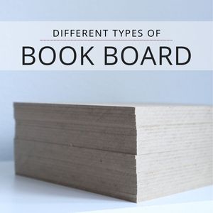
For the boards, I chose 1.9mm green board and custom cut it to fit the book.
Choosing a design & finishing techniques
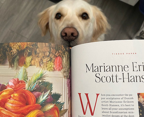
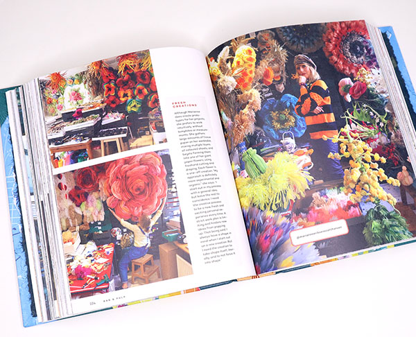
When my copy arrived, I was stunned at how gorgeous it was. The spreads are incredible. Each one is full of contrasting and beautiful colors with so many artists to read about and enjoy. I was particularly inspired by the burnt orange color used for the first letter of each new chapter as well as brilliant hues of blue, green and yellow. Here’s a photo of the burnt orange color I mentioned with a bonus Freya cameo:
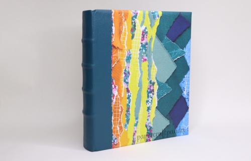
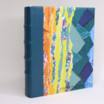
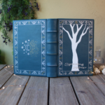
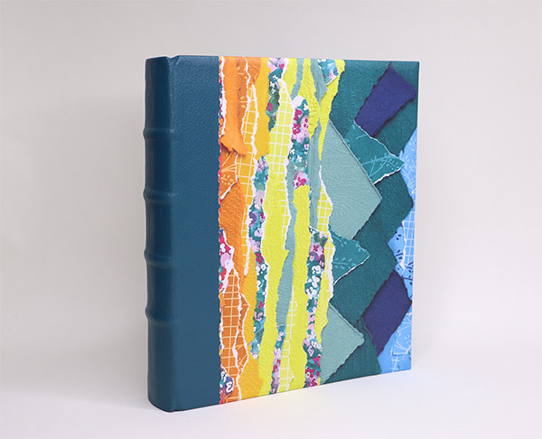
Books are meant to be handled and I knew I’d be flipping through this one often. To make sure the spine would be flexible yet strong, I decided on a leather quarter binding with paper covers and hand sewn endbands.
I went with a deep teal Pentland goat leather and was very fortunate to find a lovely cover stock made of painted ripped sheets of various papers. These paper has vibrant colors, just like the ones found inside the text itself. It really felt like a combination made in heaven!
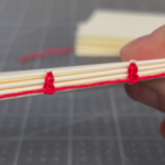
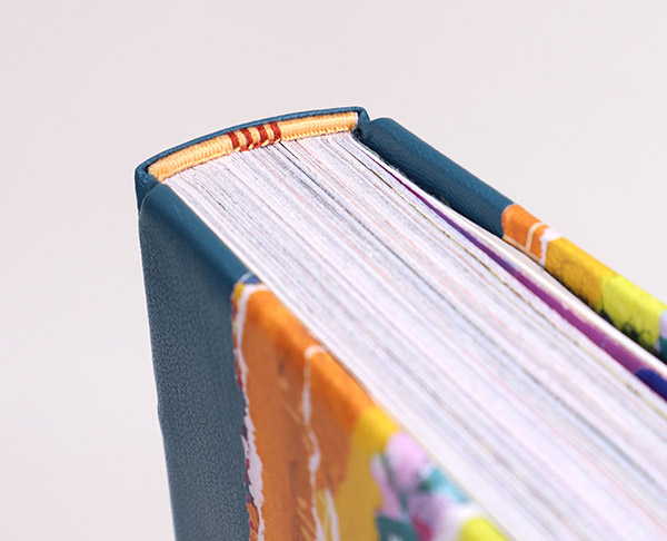
For the endbands, I did something a little different. I went with a single core band and yellow gold silk thread with burnt orange silk thread stripes in the center as a callback to the first letter of each chapter.
For the endpapers, I tore apart pieces of teal and blue cotton rag paper and then glued them together into full sheets. This was harder than I thought it would be. The paper was a mere 35lb with a high cotton content and visible fibers, so gluing it down made for a sticky hairy mess. If I had to do it again, I would employ a few extra tricks to make it easier. I love the end result, so it was absolutely worth the effort.
Once finished, I pressed the book for 6 weeks before taking photos. It was really important to do this because Washington winters are wet and rainy. I didn’t want any excess water bloating the book or deforming the pages before photo shoot day.
The completed book
I’m a bit biased, but I absolutely LOVE how this book turned out. If you know me, then you know how rare it is for me to like one of my own books (ha!). I typically criticize the heck out of my own work, but this time I didn’t need to. I took the time needed to really focus and work on the book. While there were quite a few mistakes, each one was easy to fix with very little impact to the final design. The biggest “problem child” wound up being the one I suspected the least: those pesky endpapers! Gluing them down was just as much an exercise in puzzle building as it was patience. That’s okay, though. This book was all about working with paper, so where would this book be without some creative paper problems? Exactly. 😉

Learn more about this bookbinding exhibition
- Mini Exhbition website featuring my work + other binders & artists for this edition: https://ragandpulpbinding.wordpress.com/
- Learn about Rag & Pulp: Creativity with Paper and order a copy for yourself: https://uppercasemagazine.com/products/ragpulp
More bookbinding goodness
✨ What tools do I need to get started bookbinding?
- Bookbinding Tools & Supplies Quick Start Guide – learn all about book making tools, which to buy first & where to go online
- Pick up my popular Complete Starter Bookbinding Tools Kit – all the bookbinding essentials in one spot
🌟 Looking for a simple way to start making books?
Try a Complete Book Materials Kit. Each one has everything you need (+ tutorials & videos) to make a beautiful book without all the fuss.
Thank you for taking me along on your book making journey!
Misty
